
I chose this style for a reason. Campaign Cartographer 3+ is currently the latest purchasable version, and this style is one of its new features. I wanted black and white for cheaper printing and creative use: printing on precolored parchment-like paper, for example, or placing the map over a parchment pattern in a graphics program and printing it on textured paper such as Canon Fine Art Paper, Museum Etching. Its slightly broken-looking surface can contribute to the appearance. Cut out the map, perhaps carefully singe the edges with a lighter or burn through a less important spot, and you can hand players a more interesting physical copy. A beautiful color map cannot perform that trick. Both approaches have advantages online, where backgrounds and other details can also make these maps more interesting. The black-and-white appearance helps it resemble the copy the characters see.
Planning and the GM's copy need a grid, even if it is unattractive. That will be the first thing switched off when handing the map to someone else. We now know our starting settings. Time to launch the program, if we own it, and start a new map with settings suited to our aims. I will show the main steps in pictures because video is easy to fall behind. We therefore begin with the empty map and a short explanation of how to reach it. The manual covers many technical details, so I will focus on what we do and why.
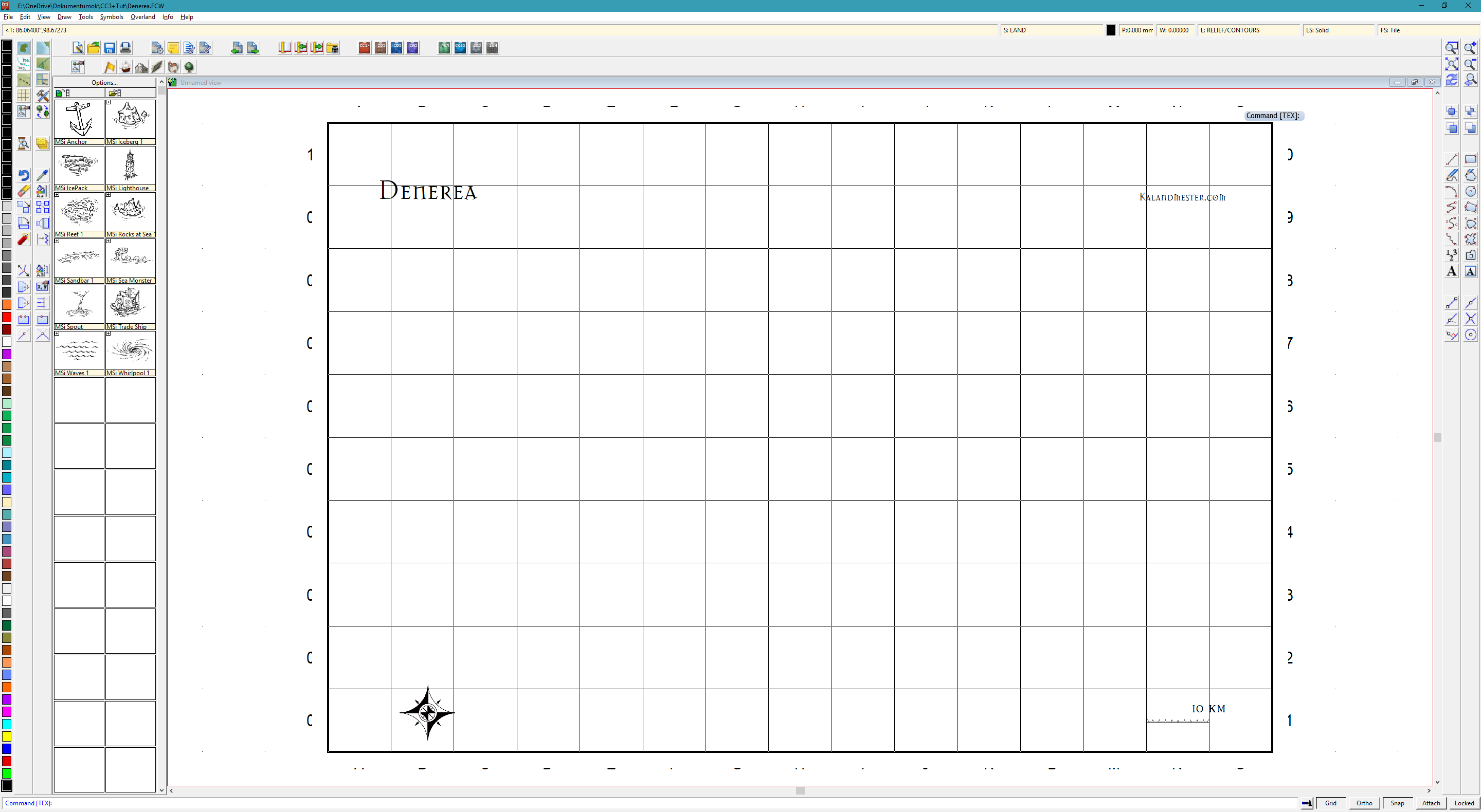 Reaching the image above is relatively simple. As we can see, this style's default grid labels are not ideal. Resizing the copyright notice, changing the scale-bar value, and adjusting the bar with a simple scale command from the left toolbar account for the visible changes from the default image. After File → New, I selected the style under Overland, requested no background, and requested a grid. That was good; requesting numbering was not. Under Tools → Snaps, the Grid option let me create an invisible one-kilometer grid for snapping the cursor. The default grid has ten-kilometer spacing, which is unpleasant on a map only 150 by 100 kilometers.
At the upper left is an icon for drawing sea, with the island tool to its left. There are also lovely large symbols for decorating the sea and other things:
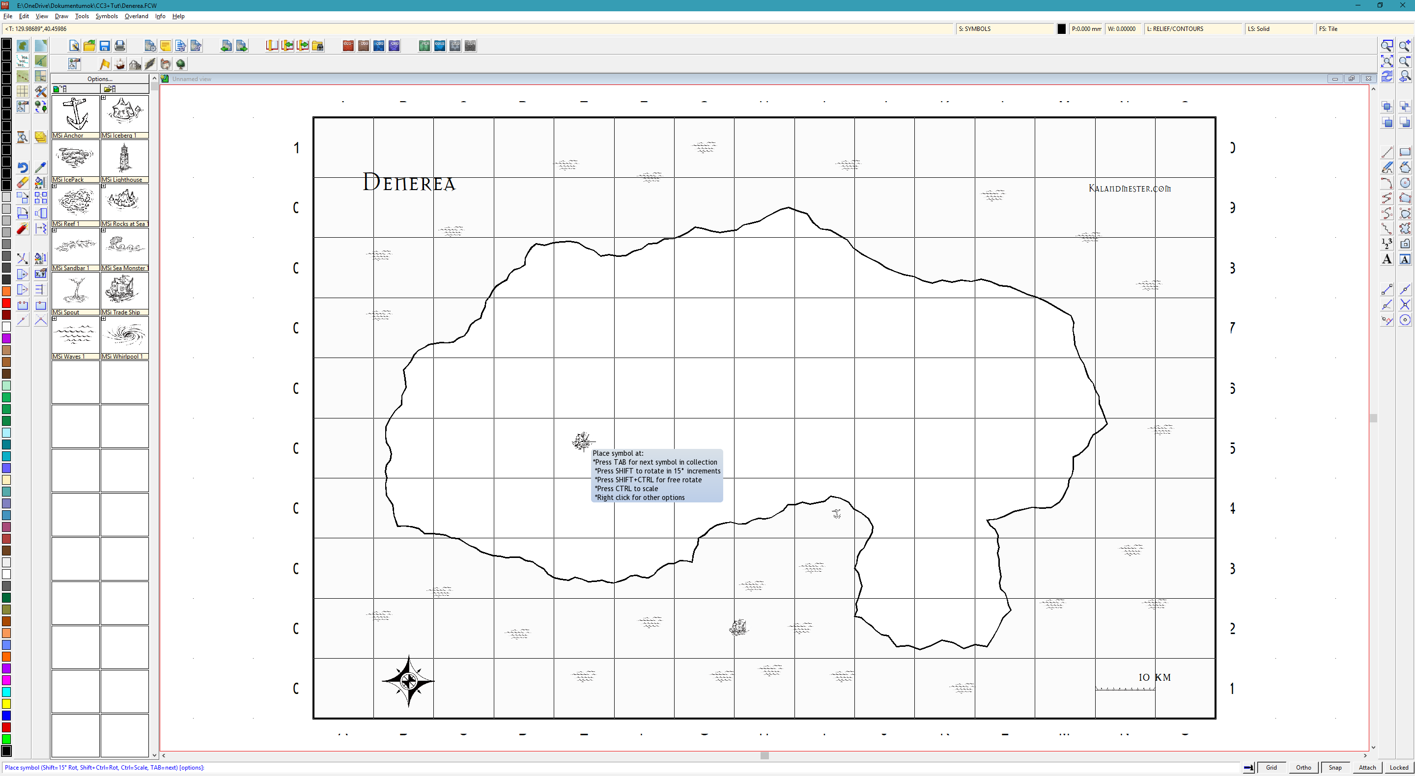
Clearly, no stretch of the island's coastline is straight. The program creates those irregularities as we draw. The fractalize command can also increase a line or shape's irregularity afterward. The map is far from right yet, but some foundations are visible. Click the mountain icon above to display mountain symbols, and scatter them from upper left toward lower right. Right-click the third icon in the second toolbar from the left and select a forest type to draw woodland around the mountains. The result is still far from good. We can plainly feel it should not look as it does.
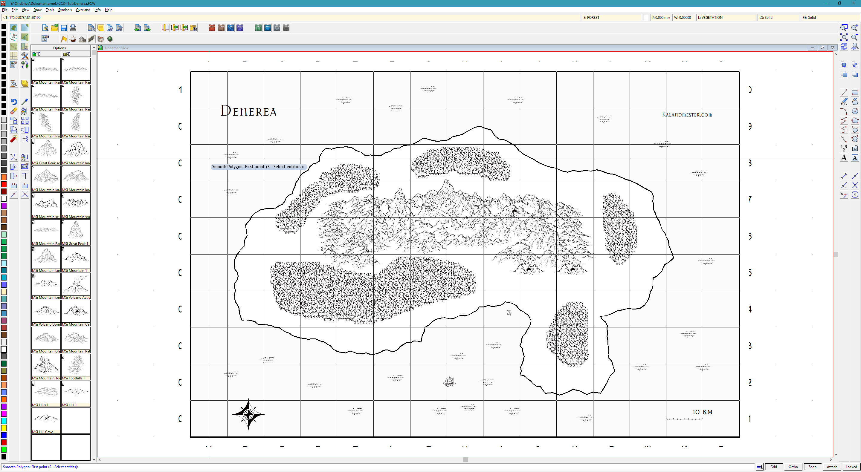
What is definitely missing? Labels, settlements, rivers, and assorted large and small decorations. I have not placed simple hill icons in many areas, leaving no transition between mountains and plains. Where woodland gives way to mountains, that is understandable; elsewhere, less so. Hills are missing because I plan to place them after rivers and river valleys. Rivers and settlements are therefore the next important step. As you can guess, we select the river icon on the left and draw rivers. Switch off Snap at the bottom. On reaching the sea, specify that the next point lies exactly on another line; the right-hand toolbars contain these modifier options. Roads, towns, and many small details should similarly be distributed.
Some towns belong beside rivers, and a river mouth in a bay can support a larger settlement. A few ruins provide adventure locations. The aim is to think through where people live and what supports them. I consider the sea one of the island's important resources, through trade or fishing. There will therefore be several fishing villages, and perhaps mining settlements at the mountains' feet, from which goods can travel downriver by raft or boat. The island is currently sparsely populated, with a few ruined, abandoned settlements too.
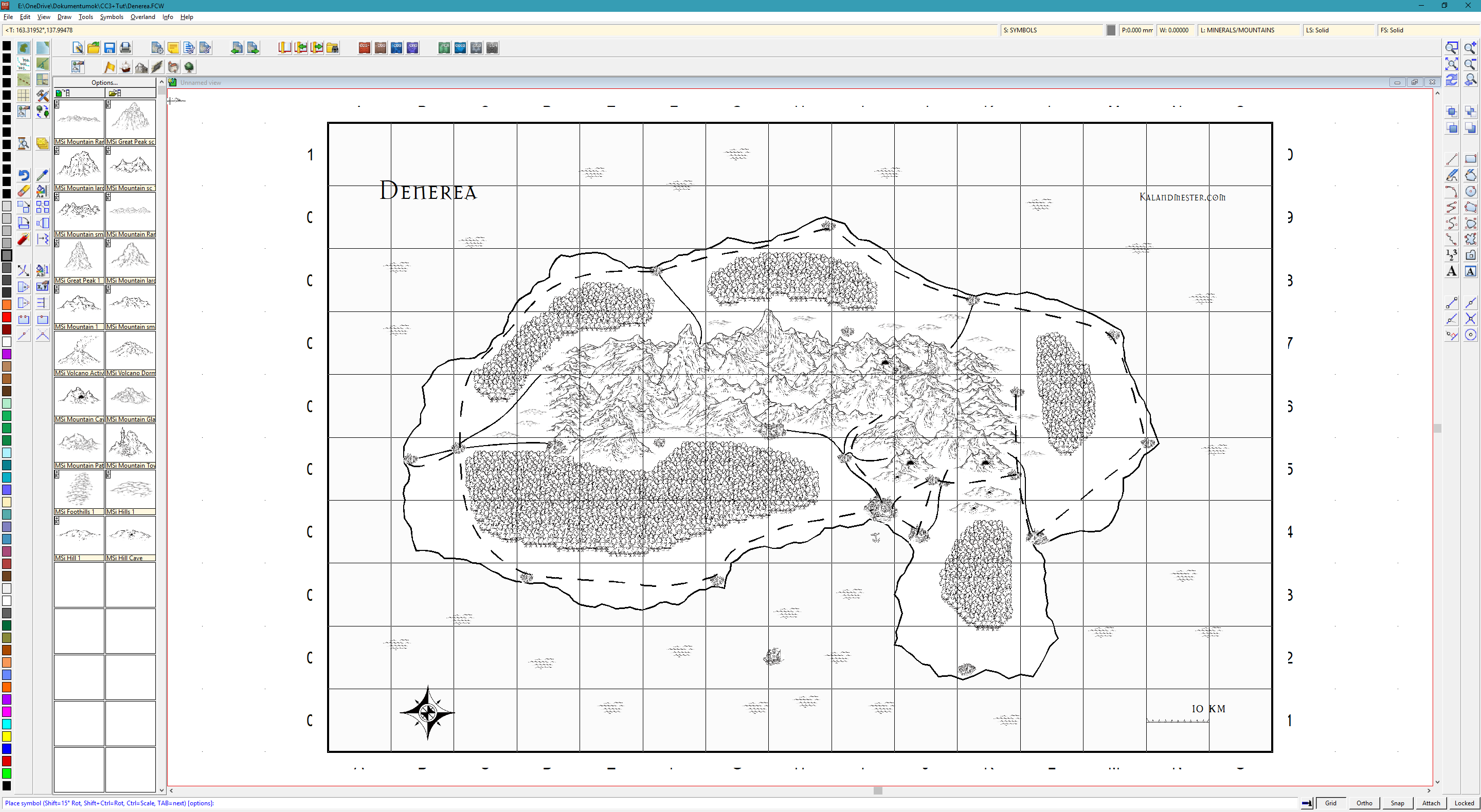
What happens with a few labels and some shading? I think the result becomes quite map-like. The familiar grid-label problem remains. Sorry, but I did not seek a font supporting accented characters: I kept the default lettering and did not fit it to curves. Nor did I manually place dots and commas as accents. The main aim is to demonstrate a few simple steps, leaving those tricks for another time.
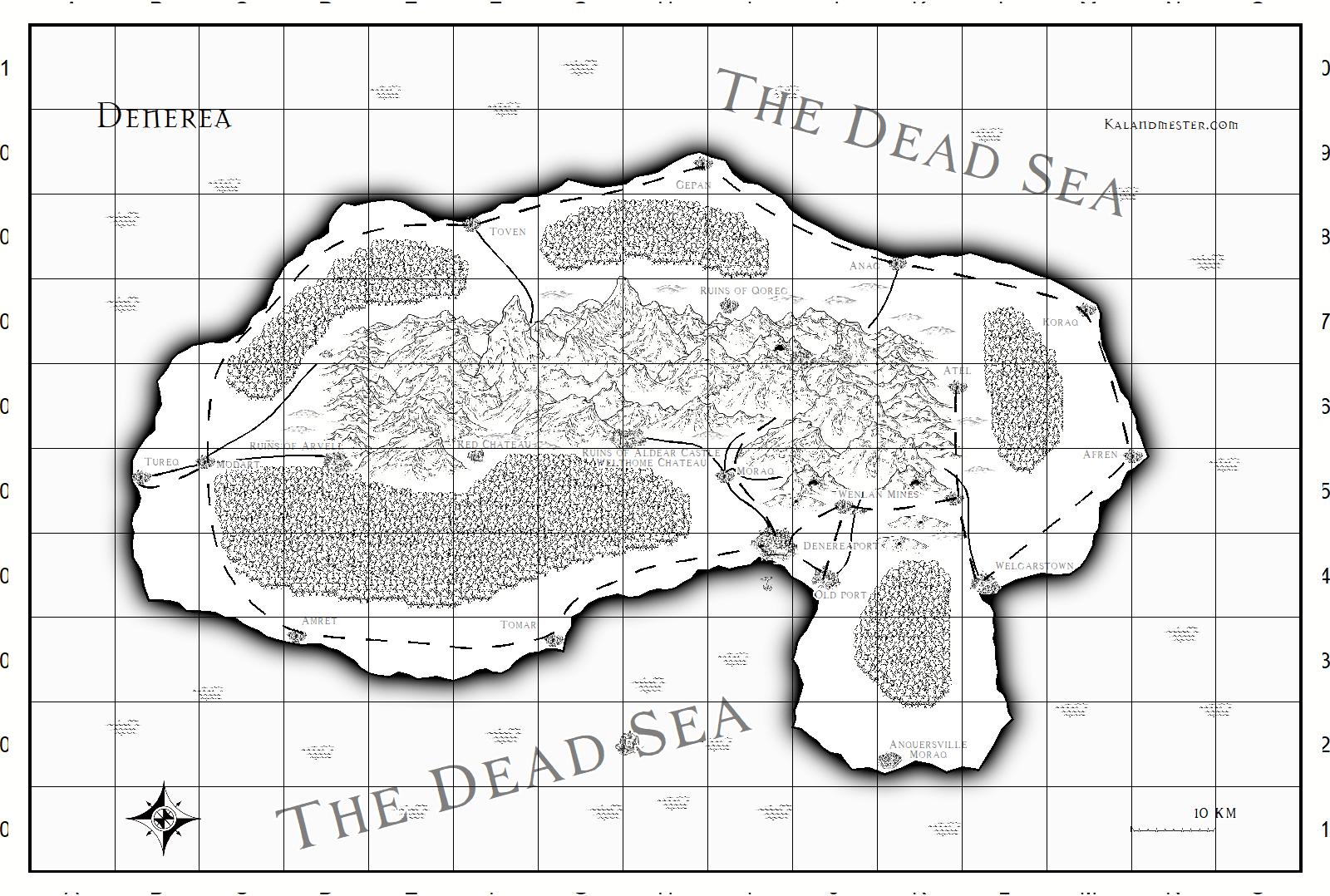 Finishing the map gains us much, but costs us much too. Player characters can calculate distances accurately, though we did not necessarily place locations to suit adventures' ideal timing. There is plenty more to think through. Making existing effects a little subtler than their defaults gives us a usable basic map. This really is what you can produce with minimal investment, practice, and tools.