
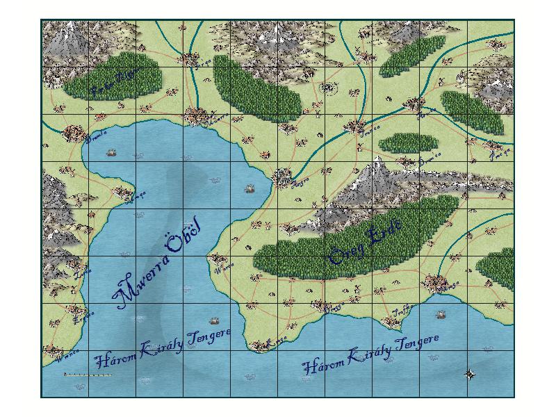
 Ten thousand forints is not a little money. It is not an amount most people spend on a sudden emotional impulse; impulse purchases tend to involve less. Depending on the pound's exchange rate, Campaign Cartographer 3+ costs roughly that much. Add-ons cost half as much again, and you discover you need one each for proper city or dungeon maps. The discounted bundle of all three costs 23,000 forints. You see professionals' work, but professionals remain professionals with paper and pencil, and a YouTube tutorial does not change that. Yes, this offers more than other fantasy mapping packages, with many add-ons and proper support, but you have no idea whether you can use it. There is a good textbook, costing around 5,000 convertible Hungarian forints, but it leaves out more than half the problems. It explains every technical detail, yet using those details requires knowing exactly what you want to draw. Its 711 pages say little about world design. Spending nearly 30,000 forints to discover you cannot do it is hardly attractive.
Programs like these came up in a Facebook group, along with the suggestion that I show a map made by me rather than a professional. I thought that called for a review and tutorial, presenting something that lets you assess what a beginner can achieve. Something else soon occurred to me: the Game of Thrones creators' explanations for the season's regular teleportation. Few stories seemed more instructive when deciding what sort of map to give the PCs.
“They seemed to be very concerned about how fast a raven can fly but there’s a thing called plausible impossibilities, which is what you try to achieve, rather than impossible plausibilities.”
It is not my job to attack HBO's series, even if a thousand solutions could have worked. Many reasons could have put Daenerys in the right place in time without teleportation. Many other cases likewise offered creative solutions to replace the show's unintended teleportation. IGN's Hungarian translation of the interview uses expressions roughly meaning “credible absurdity” and “absurd credibility.” The trouble is that this is surprisingly sloppy translation. It omits, for example, the primary meaning of impossible. It says nothing about something being impossible, and the original is not discussing authenticity either. What matters is whether impossibility is the noun and plausible the adjective, or the reverse. Used as a noun, the impossible belongs to fantasy: there are always many unknowns that can make apparently impossible things real. But if impossible is the adjective, and the audience notices, there is trouble.
One of the greatest GM mistakes is giving a player information their character lacks, which triggers out-of-character thinking that destroys the story's plausibility. A map is a minefield in itself, because following every technical tip can still yield a wholly unrealistic result. Buying the expensive textbook for the exorbitantly expensive program and using the best tools does not prevent that. I recall that in Delta Vision's nonrepresentative survey, slightly more than 600 respondents named Cartography among their most-used scholarly skills in 43 cases. Most characters have neither Cartography nor Local Knowledge. A map provides out-of-character information that becomes problematic if players reason from it. Either you work hard on plausible explanations, which is difficult, or cling to the map and sacrifice many imagined scenes and their drama, or exploit the fact that neither player nor character has a map and distances remain uncertain.
Even when you give a map, the in-adventure object would usually be an inaccurate sketch by a nonexpert. It certainly would not be colorful, flashy, precise, and zoomable. Why should yours need to be more colorful and flashy? More important is easy modification and easy handling of GM-only layers. Zooming in and out helps too. Two approaches diverge here: one does not even attempt this, producing simple bitmap maps measured mainly in pixels; the other works with vectors, allowing proper units such as millimeters, meters, kilometers, or inches, feet, yards, and miles. That immediately raises an important problem.
The prettier symbols are bitmap images, as are many fill patterns. Campaign Cartographer 1, 2, 2 Pro, and the related Campaign Mapper, included on an AD&D Core Rules CD-ROM, worked entirely with vectors. Campaign Cartographer 3 and 3+ instead use a distinctive vector-bitmap hybrid. Rival Fractal Mapper and a few open-source imitations are entirely vector-based too. Most symbols nevertheless have fairly high resolution. What is the point? The answer lies in a consideration most descriptions ignore. Imagine a small estate with only a few villages, hills, or small mountains. You need more than a pretty symbol showing a mountain's presence. You want to define where the mountain is, with roads following its shape to avoid excessive steepness. Eventually you switch from symbols to drawing tools. The same happens when mapping a dungeon or showing players a building's floor plan.
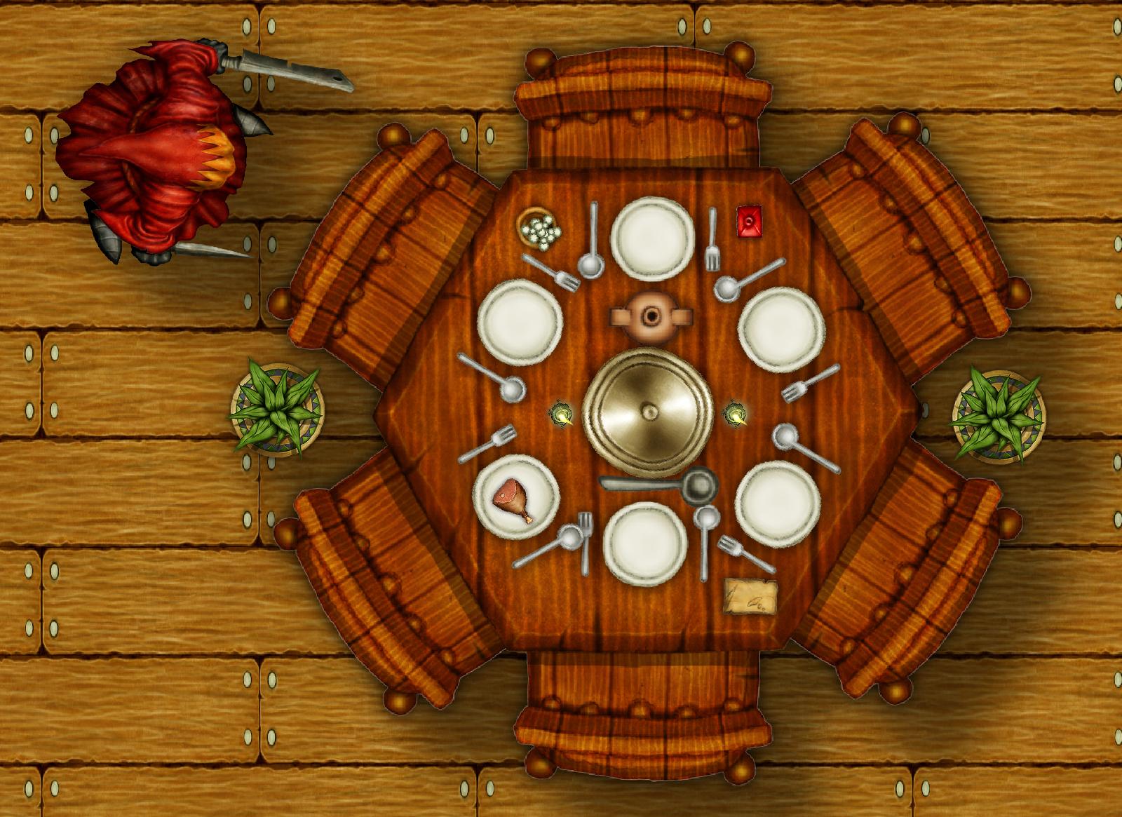
The image above does show some resolution limits, true. Suitable effects would blur them, and the paper could have an extra pattern suggesting writing. For a combat battle map, this resolution even seems excessive. For thoroughly examining a room during an investigative adventure, the available symbols would be insufficient anyway. On the plain wooden-floor background above is a six-person table symbol with six place settings, a sheet of paper, a covered dish, a serving spoon, a jug, a bottle, two candlesticks, a small bowl, and one sheet of paper. I put a handful of coins from the treasures in the bowl and a piece of meat on one plate. Beside the table went two plants and a cultist. That is 22 symbols, plus one drawing tool.
Imagine an inn mapped this way: six tables, some set, others not, some with leftovers, and no two in the same state. Add a bar, chairs, shelves, more bottles, and the kitchen at the back. Adding the upstairs at this detail quickly means placing hundreds of symbols. Sometimes you zoom, sometimes you do not. Some things are for the players to know and others are not. Campaign Cartographer offers an interesting dual-layer arrangement: layers and sheets. One handles stacking and effects; the other handles visibility and freezing, letting you manage GM and player versions easily. You have a hell of a lot of good tools, so exceptional dexterity is unnecessary. Patience is necessary, though, and placing everything, especially deliberately designing the imagined environment, takes plenty of work.
Let us begin with a relatively simple map: an island in Mike Schley's simple black-ink style.
I chose this style for a reason. Campaign Cartographer 3+ is currently the latest purchasable version, and this style is one of its new features. I wanted black and white for cheaper printing and creative use: printing on precolored parchment-like paper, for example, or placing the map over a parchment pattern in a graphics program and printing it on textured paper such as Canon Fine Art Paper, Museum Etching. Its slightly broken-looking surface can contribute to the appearance. Cut out the map, perhaps carefully singe the edges with a lighter or burn through a less important spot, and you can hand players a more interesting physical copy. A beautiful color map cannot perform that trick. Both approaches have advantages online, where backgrounds and other details can also make these maps more interesting. The black-and-white appearance helps it resemble the copy the characters see.
Planning and the GM's copy need a grid, even if it is unattractive. That will be the first thing switched off when handing the map to someone else. We now know our starting settings. Time to launch the program, if we own it, and start a new map with settings suited to our aims. I will show the main steps in pictures because video is easy to fall behind. We therefore begin with the empty map and a short explanation of how to reach it. The manual covers many technical details, so I will focus on what we do and why.
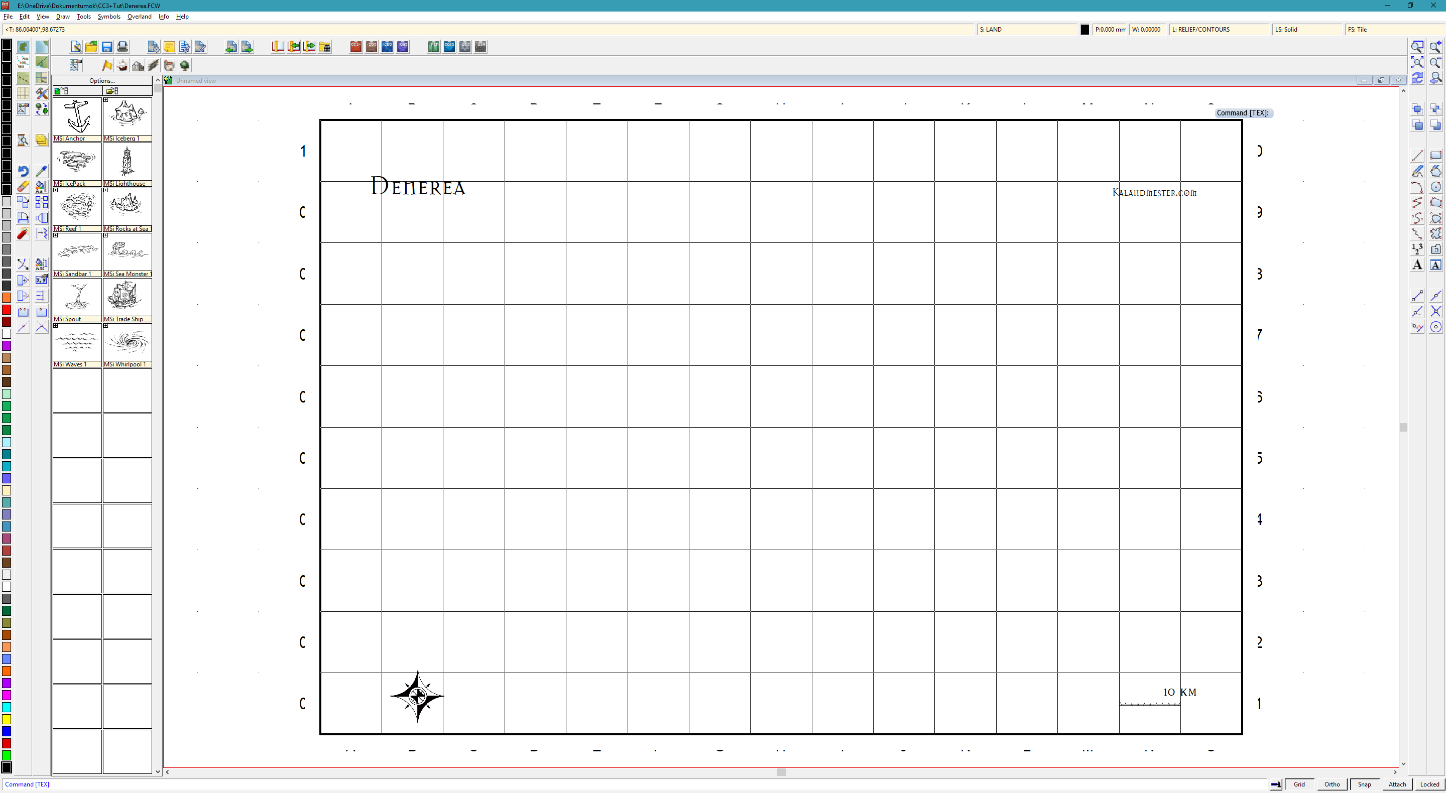 Reaching the image above is relatively simple. As we can see, this style's default grid labels are not ideal. Resizing the copyright notice, changing the scale-bar value, and adjusting the bar with a simple scale command from the left toolbar account for the visible changes from the default image. After File → New, I selected the style under Overland, requested no background, and requested a grid. That was good; requesting numbering was not. Under Tools → Snaps, the Grid option let me create an invisible one-kilometer grid for snapping the cursor. The default grid has ten-kilometer spacing, which is unpleasant on a map only 150 by 100 kilometers.
At the upper left is an icon for drawing sea, with the island tool to its left. There are also lovely large symbols for decorating the sea and other things:
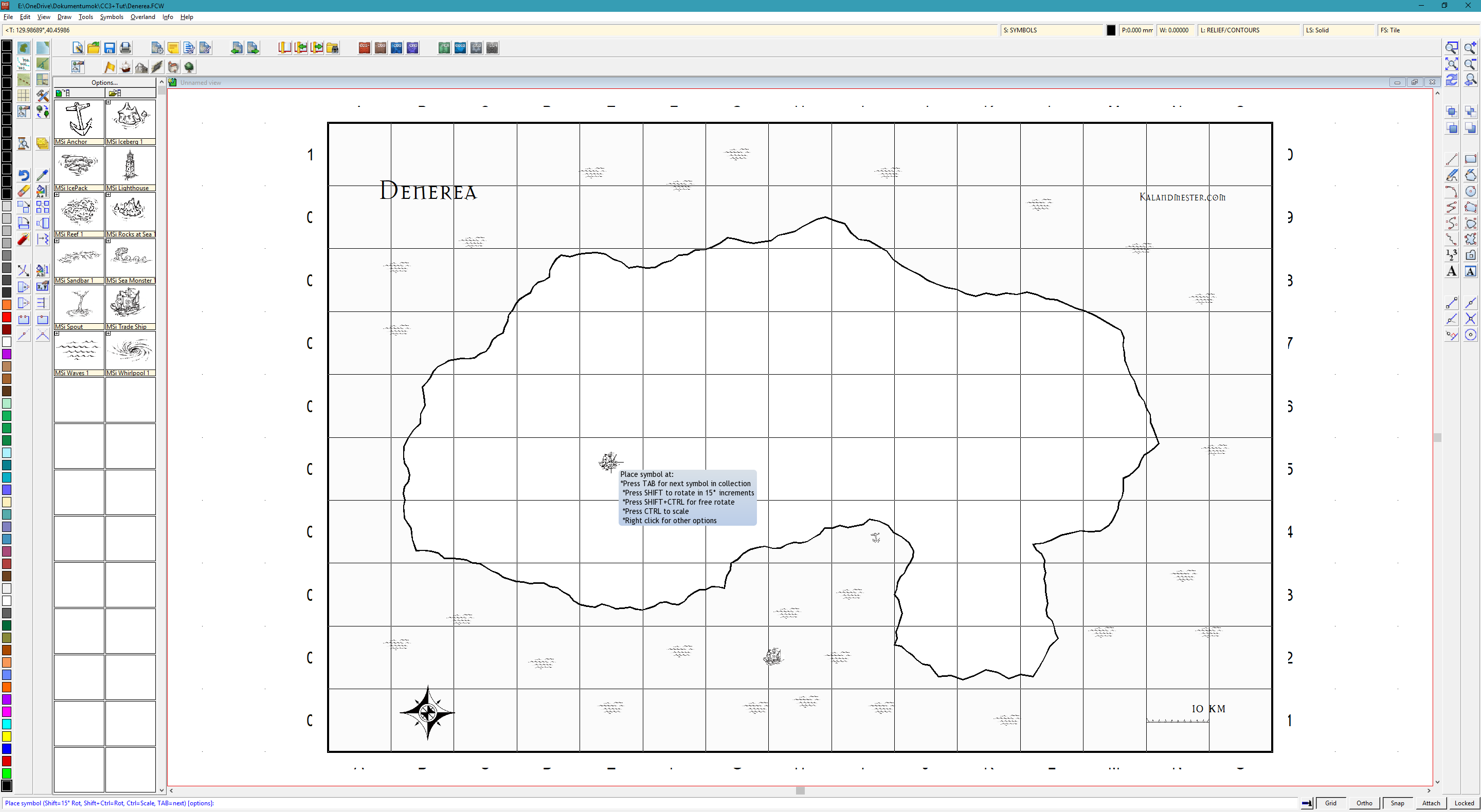
Clearly, no stretch of the island's coastline is straight. The program creates those irregularities as we draw. The fractalize command can also increase a line or shape's irregularity afterward. The map is far from right yet, but some foundations are visible. Click the mountain icon above to display mountain symbols, and scatter them from upper left toward lower right. Right-click the third icon in the second toolbar from the left and select a forest type to draw woodland around the mountains. The result is still far from good. We can plainly feel it should not look as it does.
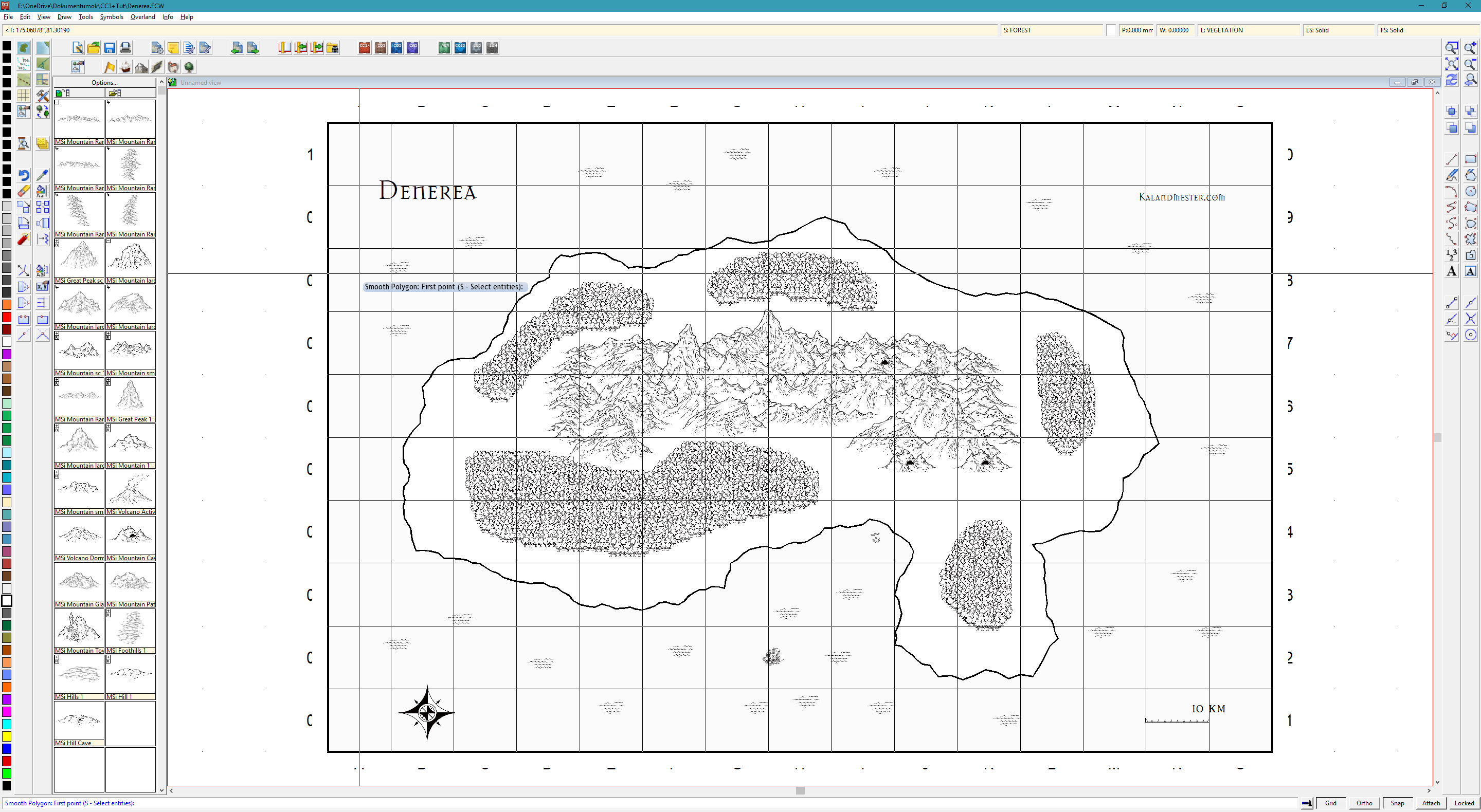
What is definitely missing? Labels, settlements, rivers, and assorted large and small decorations. I have not placed simple hill icons in many areas, leaving no transition between mountains and plains. Where woodland gives way to mountains, that is understandable; elsewhere, less so. Hills are missing because I plan to place them after rivers and river valleys. Rivers and settlements are therefore the next important step. As you can guess, we select the river icon on the left and draw rivers. Switch off Snap at the bottom. On reaching the sea, specify that the next point lies exactly on another line; the right-hand toolbars contain these modifier options. Roads, towns, and many small details should similarly be distributed.
Some towns belong beside rivers, and a river mouth in a bay can support a larger settlement. A few ruins provide adventure locations. The aim is to think through where people live and what supports them. I consider the sea one of the island's important resources, through trade or fishing. There will therefore be several fishing villages, and perhaps mining settlements at the mountains' feet, from which goods can travel downriver by raft or boat. The island is currently sparsely populated, with a few ruined, abandoned settlements too.
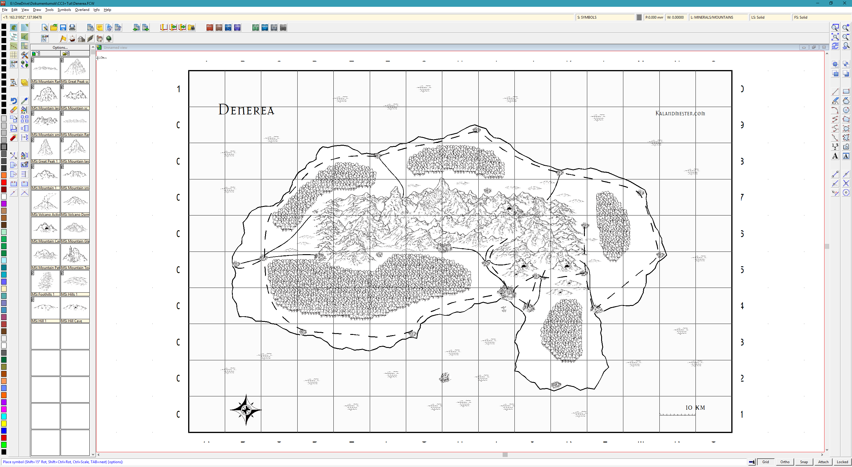
What happens with a few labels and some shading? I think the result becomes quite map-like. The familiar grid-label problem remains. Sorry, but I did not seek a font supporting accented characters: I kept the default lettering and did not fit it to curves. Nor did I manually place dots and commas as accents. The main aim is to demonstrate a few simple steps, leaving those tricks for another time.
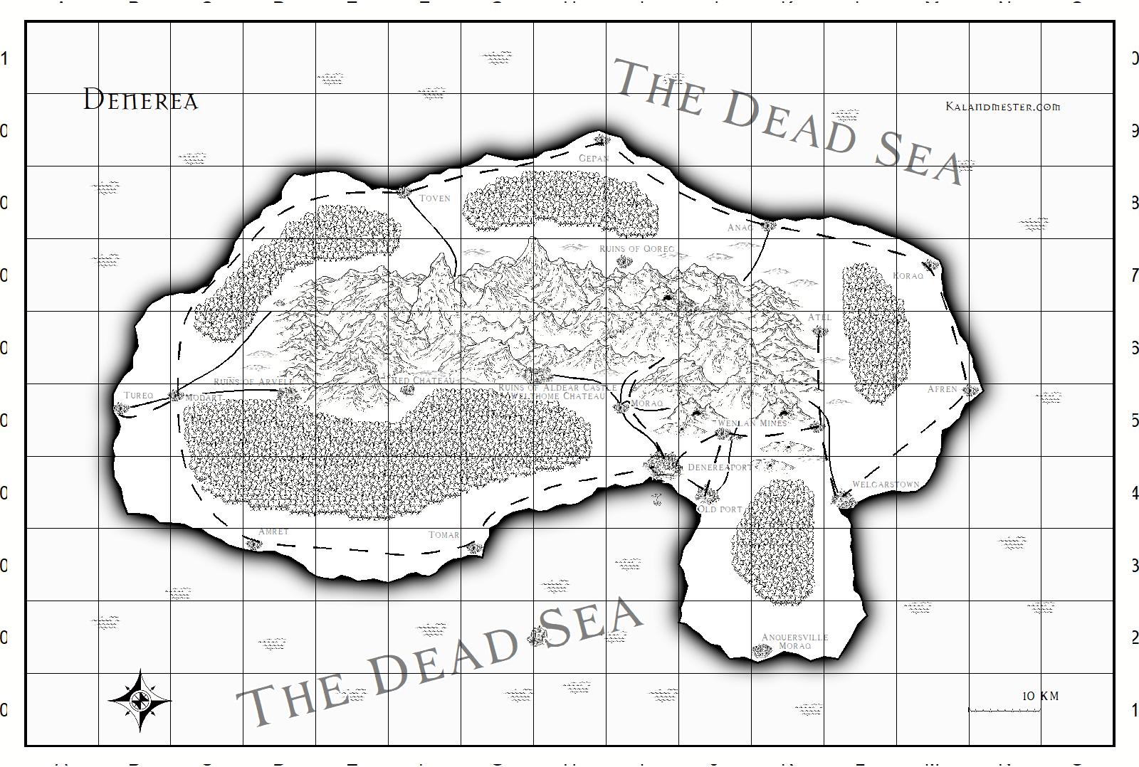 Finishing the map gains us much, but costs us much too. Player characters can calculate distances accurately, though we did not necessarily place locations to suit adventures' ideal timing. There is plenty more to think through. Making existing effects a little subtler than their defaults gives us a usable basic map. This really is what you can produce with minimal investment, practice, and tools.